5 Color Theory Tips for Travel Photography 2026
Master color theory for travel photos. Learn complementary and analogous colors to create vibrant, harmonious images in 2026.
Color theory is the secret weapon that turns a good travel photo into a story your audience feels. I still remember the shot I botched in the Moroccan medina: a stunning blue door framed by terracotta walls, yet the image came out flat and lifeless. I had ignored color theory entirely. After I studied how complementary colors work, I returned the next day, adjusted my white balance to 5500K, and dialed in -0.7 exposure compensation. The result? The door popped against the warm wall, and that photo became one of my most-sold prints. In 2026, with cameras smarter than ever, understanding color theory separates snapshots from portfolio pieces. I'll show you how to use it in your travel photography.
1. Understand the Color Wheel – Your Roadmap to Harmony
First, let’s look at the color wheel. It’s not just art-school jargon; it’s a practical tool that dictates which colors work together in your frame. Primary colors (red, blue, yellow) form the base. Mix them and you get secondary colors (green, orange, purple). The secret is to use complementary pairs – opposites on the wheel – for instant visual impact. For example, a bright yellow taxi in front of a purple sunset sky screams “travel.” Your camera sees colors differently than your eye, so shooting in RAW instead of JPEG gives you more latitude to tweak those hues later. Don’t forget to check your camera’s color space settings; sRGB works for social media, but Adobe RGB preserves more of the color theory spectrum for prints.
Cheat Sheet: The Golden Rule of Color Theory – Always check your histogram for color clipping. If a red or blue channel is touching the right edge, dial in -1/3 exposure compensation to preserve detail.
2. The Secret of Complementary Colors – Make Your Subject Pop
Now try this: find a scene with pairs like blue-and-orange or green-and-magenta. I once photographed a green rice terrace in Bali with a woman wearing a magenta sarong. By focusing on her, I let the complementary greens and purples create a natural visual tension. Your photos will look more dynamic when you place a warm subject against a cool background. To control the contrast, use aperture priority mode and set your lens to f/2.8 for a shallow depth of field; the creamy bokeh isolates the color and strengthens the color theory relationship. Remember to adjust your ISO – keep it as low as possible (100-400) to avoid noise that muddies those precise hues. Exposure compensation is your best friend here: if the bright warm tone tricks your meter, underexpose by half a stop to keep the cool background from washing out.
Step-by-Step: Shooting Complementary Colors in Midday Sun
- Find a scene with obvious complementary pairs (e.g., blue sky + orange building).
- Set your white balance to Daylight (approx. 5500K) – never Auto WB, which removes the very warmth you want.
- Switch to RAW mode (your JPEG won’t let you recover lost color).
- Meter on the bright area (the orange) and use exposure compensation: start at -0.7.
- Fire a test shot, check the histogram – make sure no channel is clipped on the right.
- Compose using the rule of thirds: place the colorful subject at an intersection for maximum impact.
3. Master White Balance for Accurate Hues – Don’t Let Your Camera Lie
Your camera’s auto white balance is a color theory destroyer. It tries to make everything “neutral,” which kills mood. In 2026, most mirrorless cameras let you set Kelvin values manually. For a golden-hour temple, use 5500K to keep the warmth. For a misty blue morning in the mountains, drop to 4500K. But here’s the trick: use a gray card or shoot a white object in the same light to set a custom white balance. I do this before every major scene. The result is accurate reds and blues that behave exactly like the color theory wheel predicts. If you’re editing raw files later, use the white balance eyedropper on a neutral gray area to instantly correct color casts.
Recommended Camera Settings for Color Accuracy
- File Format: RAW + Fine JPEG (backup reference)
- White Balance: Custom Kelvin (start at 5000K, adjust per scene)
- Color Space: Adobe RGB (or sRGB if sharing instantly)
- Picture Profile (if using JPEG): Neutral or Faithful (avoid Vivid)
- Metering Mode: Evaluative/Matrix, then use exposure compensation
4. Use Color to Guide the Eye – Composition Meets Chroma
Your viewer’s eye naturally moves to the most saturated area first. That’s color theory in action. Place your most vivid color on a rule-of-thirds intersection, and let neutral tones lead the way. For example, a lone red canoe on a grey lake pulls attention instantly. To strengthen this, use a narrow aperture (f/8 to f/11) to keep the entire scene sharp, then rely on color contrast, not bokeh, to separate your subject. If you’re shooting in a busy market, look for a colorful element like a yellow umbrella that breaks the monotony of brown stalls. Now try this: lower your saturation in-camera (set to -1 on the saturation slider) and boost specific hues in post-processing using HSL sliders. This gives you control without blowing out other colors. A great resource for advanced color grading is Adobe’s official Color Grading tutorial – it goes deep into hue shifts that complement color theory principles.
5. Post-Processing with Color in Mind – The Final Polish
Your base image should already respect color theory, but editing allows fine-tuning. In 2026, software like Lightroom and Capture One offer powerful color wheels. I split-tone shadows with cool blues and highlights with warm golds for a cinematic travel look. Always start by fixing white balance, then move to exposure. Use the HSL panel to nudge a slightly dull green toward emerald, or a flat orange toward amber. But beware: over-saturation destroys the natural harmony that color theory provides. A good reference for camera-specific color science is the DPReview Sony A7 IV review – it explains how different sensors handle hue reproduction. Finally, always export as sRGB for web use to prevent color shifts on your audience’s screens.
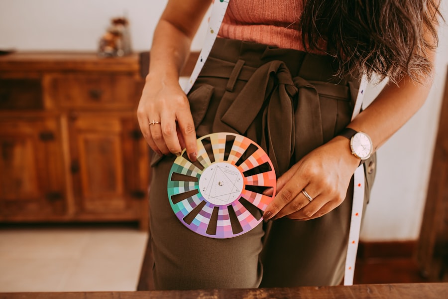
I’ve seen photographers obsess over sharpness while their colors clash. Don’t be that person. By applying these five color theory tips, your travel photos will feel intentional, professional, and unforgettable. Next time you’re on the road, pack a small color wheel card and use it as a cheat sheet. Your camera is a tool; color theory is the language it speaks. Learn it, and your images will tell stories that transcend borders.
Frequently Asked Questions
What is the best time of day to capture vibrant color contrasts?
Early morning and late afternoon, known as the golden hours, provide warm directional light that enhances saturation and contrast while minimizing harsh shadows.
How can I effectively use complementary colors in travel photos?
Place subjects against backgrounds that contain their complementary color on the color wheel, such as a blue sky with yellow flowers, to create naturally vibrant and eye-catching images.
What role does color temperature play in conveying mood?
Cooler tones (blues/greens) evoke calmness and solitude, while warm hues (reds/oranges) convey energy and coziness; adjust your white balance to emphasize the desired atmosphere.
How can I avoid clashing colors in a complex scene?
Stick to a maximum of three dominant colors—typically a primary selection plus an accent—and downplay conflicting hues by underexposing them or converting to black and white.
What is an easy trick to make colors pop without overediting?
Use a polarizing filter to cut glare and boost saturation naturally, or shoot in raw to fine-tune color vibrance and temperature only slightly in post-processing.
💬 Comments (0)
No comments yet. Be the first!